Facebook Slideshow Ads That Sell – Video Examples
Convert viewers to buyers with professional, impactful video ads.

Table of Contents
Facebook slideshow ads are simply video ads that consist of a series of (usually) static images that are overlaid in sequence or animated to slide in and out. These can consist of multiple photos, videos, or text elements.
Of course you can also use videos instead of static images, whereby short video clips slide in and out but otherwise follow a similar approach format as you would for a slideshow with static images resulting in a hybrid video-slideshow.
Slideshow ads are a mainstay of Facebook video ads, for good reason. Merchants and businesses often do not have a lot of high quality video content on hand, and want to get as far as they can using the static images they do have.
Usually these will be product pics, stock photos or some combination of these.
Why use Slideshow Ads? To Get More Customers!
Turning your static image content into a slideshow means:
- Your ad is now a Facebook video – you can see stats on watch time, you can retarget based on watch time.
- You can communicate more than in a static image ads and photo ads. I.e. you can show multiple products and captions in a few seconds.
- You can draw attention to your ad more effectively using a bit of motion.
- A whole range of creative approaches is now open to you.
- Video often gives better overall results than static images.
Facebook video slideshow ads are a great way for brands to show off their products and services, especially for brands with a lot of visual appeal so don’t overlook the potential of this format in your Facebook marketing toolkit!

The Anatomy of Successful Facebook Slideshow Ads
I’ve often been in that position where I don’t have a lot to work with in terms of promotional content only having some pictures of the product, so and need to make do and connect with my target audience using what is at hand.
This being the case, I have had to get creative with my slideshow creation when running ads, to serve up different visual flavours of what it is we are selling, in a way that captivates and converts profitably.
Be aware that average watch times for Video Ads usually are to be found around 3-6 seconds. In order to get results when running ads using slideshows, you will want to:
- Move beyond ‘simple’ Facebook slideshow ads and get creative.
A basic slideshow with alternating pics can be well and good, and it is possible to create slideshows directly in Facebook Ads Manager.This article is not about those default slideshows that you can make in Facebook. In order to create really effective Facebook advertising creatives, you will want to use a specialized software or cloud platform that allows you to execute your vision with a bit more creative control.
I have listed plenty of tools you can use for this in the section ‘Resources to Create Great Facebook Ads, my favorite from that list is Offeo. I’ve got some great facebook ads examples for you to copy further down on this page.
- Create Facebook video ads that are not overly long.
People have short attention spans. If you can have your Call to Action / Endscreen appear at around the 6-8 seconds mark you will be rewarded with increased CTR’s.One trick I use is to have a CTA at 6 seconds in and another one at the end of the ad in the endscreen. Ads can be longer, but for our slideshows we will try to keep it brief, aim for 15 or max 30 seconds. After that it is getting too long.
Keeping it short is something I always struggle with, I want to cram moar and moar in there. Try to control any such impulses you may experience. The ad is supposed to gain the click, the website is supposed to make the sale.

- Do try and include your information in an easily digestible format and in as short a time frame as possible.
The main promotional info of Offer, Brand & Product needs to appear a.s.a.p., ideally in the first 3 seconds. Don’t waste time with long intros that do not communicate anything.
You will want to show your product. If it is ecommerce ad for a category/collection of products or there are product variations, you will want to show multiple products and variations from the category, stick but to 2-4 products if you want to keep in the 6-8 seconds range.
Unless you choose for a rapid-fire speed of cycling through the products in which case you will be able to show more products. The longer your ad is the more you can fit in, but diminishing returns will set in as your slideshow ad gets longer.
You will likely have an offer and some selling points or emotional trigger you want to communicate. Use titles, captions, subtitles and badges to get it across short and sweet.
If you have a service based offering, you will likewise have some explaining to do and using the right images and video will reinforce what you are saying or communicate some extra info.

- Use motion (animations) to draw attention to your ad.
You are competing with various distractions in the Facebook feed, but do not over do it – flashy text and images that bounce around the screen are not as effective as presenting the viewer with meaningful information that is easy to digest. The layout of the slides needs to be clean and have a clear visual flow.
I like to start with an almost static scene, and animate a secondary element to give it some motion to draw the eye. A slow animation of the image sliding to the left or right side, or a slow zoom in effect can give static images a bit of motion without giving users a headache trying to absorb what they are seeing.When I do animate an entire product image that appears or leaves the viewport, I make those move rather fast. Pictures and subtitles zip in and out so that the image and caption can remain visible for longer. We have precious little time, don’t spend too much of it on transitions between scenes and products.
- Use an Endscreen with a Call-To-Action.
Effective Facebook ads have Calls-To-Action (CTA). Create an endscreen where you can display your logo, website URL, and tell shoppers to “Order Now” < This is the CTA.You can also reiterate if you have some awesome offer or USP’s. This endscreen section should be around 4 seconds long, depending on how much info you are trying to communicate within the endscreen and the total length of the ad.
Suffice to say that using CTA’s is a must for Facebook marketing and social media video ads.
- Use Social Proof.
If you have customer reviews, show them as captions at opportune moments during your slideshow. Include names and profile pics where possible, or even better, use a short collage of video testimonials if you have them.
Social proof is one of the secret ingredients to successful Facebook marketing campaigns.
The best slideshow ads are a combination of engaging, entertaining and informative content.
We are going to look at some great Facebook ads examples that go beyond the ‘basic’ Slideshow style to inform, entertain and inspire users to keep watching and then click through to our website.
Slideshow Ads We Actually Clicked - Best In Class
I’ve seen a lot of Facebook video ads. As a Facebook advertising professional, I have spent countless hours not only browsing on social media where I am served ads just like the rest of you, but also digging in Facebook Ads Library and using Ad-Spy type tools to locate high performing ads and get creative inspiration to create my own high performing super effective Facebook ads.
I also use specialized platforms that are geared towards sourcing dropshipping products where I can browse trending products, see sales figures and view high-selling successful Facebook product ads.
Once I have pinpointed the stellar Facebook ad examples, I often create my own version of that ad, adapted to my product or service. After running those ads I get to see the granular reporting data on what works and what does not work. It’s not just theory.
So, these are not only ads that I have clicked on (or created copies of), but Ads that countless others have clicked on and taken action on, resulting in huge sales numbers for the businesses behind them.

Facebook Ads Examples Timed To The Beat
The regular default slideshow that you can create in Facebook Ads Manager is all good and well but I recommend taking a bit more time to make something more eye catching and appealing.
You don’t need to do anything crazy complicated, just some snappy transitions timed to the beat of the music and choice sound effects can work wonders as we see in these ads from TwoJeys Jewellery.
Facebook Ads Examples Vertical Scrolling
Instead of just skipping from one slide to the next in your slideshow video ad, try a continuous scrolling approach. This is much more striking and spectacular than the type of slideshow you have seen a million times before.
Ad World Conference has some fantastic examples of this type of continuous scrolling ad, learn from the best.
Facebook Ads Examples Instant Experience Style
If you have ever created or seen the type of Facebook Ad called ‘Collection’ or ‘Instant Experience’ (the terms they use get confusing), you will notice a square image or video and below that a small kind of ‘carousel’ with products.
The carousel shows up to 4 products selected by Facebook Algorithmically. When you click on this type of ad, a kind of mini-landing page opens within Facebook without sending the user to your website just yet.
So this example is emulating the look and feel of the Instant Experience, but it does send the user straight to our website when the ad is clicked upon.
I have A/B tested a lot of Ads with a standard square Facebook video or slideshow ad going up against this ‘Instant Experiece’ style slideshow ad with the extra carousel at the bottom.
Usually I see better ROAS and engagement from my target audience with the ‘Instant Experience’ style ad. In the worse case it will perform the same, so it’s definitely worth testing out.
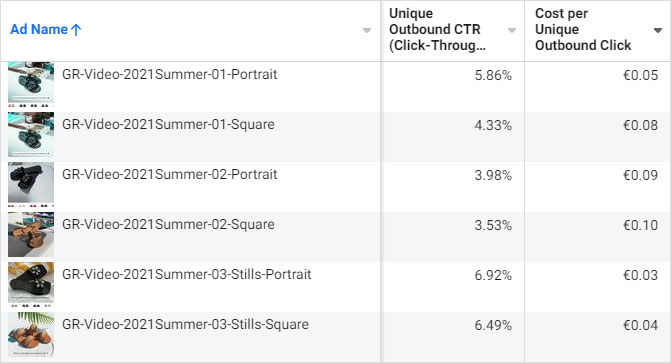
Check out these results in the screenshot below, the ads whose name ends with the word ‘Square’ are regular video/slideshow ads, the Ads whose name ends in ‘Portrait’ are ads with the product carousel at the bottom.
As you can see, the ‘Portrait’ ads outperformed the ‘Square’ ads in each case. Not by an insane amount, but every percentage point helps .
These type of slideshow video ads are perfect for Facebook product ads, i.e. for ecommerce where you have multiple products that you want to show in your ads in a short time frame, or a lot of aspects of the same product.
You can place all your product pics in the bottom carousel section, and show highlights or lifestyle shots with the product in use in the top square area.
This works well for retargeting ads, and overall as an alternative or variation of regular carousel ads.
Aspect Ratio
If you are planning on running ads using this type of Slideshow, keep in mind that the aspect ratio is 4:5, if you make your artboard 1080 x1350 pixels you will be good.
The 4:5 aspect ratio really looks great in the Facebook news feed, taking up more real estate than a square ad format. These also sit well in mobile ads like the stories ads placement, since they again take up more of the screen than a standard square format.
Facebook Ads Examples Fast Slideshow
Slideshow video ads usually show images at a kinda medium pace where you can take in what you are looking at before the next image appears. But you would be surprised how fast your brain can take in each image at a much faster speed.
This quirk of the human nature, our amazing pattern recognition ability, can be used to create more dynamic and fast-paced slideshow ads that will stand a better chance of capturing shoppers attention in their busy feeds.
It can also work well to combine regular-speed image changes with fast-speed image changes in one video.
Taking it one step further, we have the interactive fast slideshow ads. Here we combine a fast procession of images with a native-style interaction element.
See how these ads suggest to ‘Tap & Hold’ to pause on your favorite slide or product image making an interactive game out of it and leveraging the native behaviours of Instagram. When watching a Story Ad you can pause the ad playback by tapping and holding.
Facebook Ads Examples Pick One
Along similar lines as the fast slideshow, I call this format ‘Pick One’. You show a quick succession of multiple products to give an impression of your line up and communicate that there is a lot of choice and it is worth a website visit.
At the same time, the copywriting of the title invites you ‘play along’ and think about which one of the product variations on show is your favorite one.
The timing of cuts should be synced to the music as best possible. Combine all these elements into your very own super effective Facebook slideshow ads.
Expanding on this concept, I also created a ‘Poll’ ad using a similar layout with some modifications.
Facebook Ads Examples Social Proof Slideshow
This is what I call the Social Proof Slideshow. An image or video of a satisfied customer appears briefly, before a slideshow plays as the customer talks about his or her experience with the product. Simple but effective when it appears in your Facebook Feed.
Facebook Ads Examples Stop Motion
Slideshows are at their core a series of images appearing in sequence. That’s what stop motion is too. Ok if you really want to stretch it you can say that’s what video is too, but just go with it for now.
You can use the stop-motion effect to create some movement and interest from your static product images. Here is a very simple implementation of the concept.
For an ad we made here at NextLevelBros, we used a stop motion phone app to capture a series of pictures of the product in question, which then plays back in quick succession. This allowed us to show a lot of product content in a very short period of time.
If it is well executed it will shine next to the other run of the mill ads out there in the news feed of your target audience. Stop motion Ads like this have been one of the most successful types of Facebook advertising creatives we have run.
Facebook Ads Examples Create Motion From Stills
Putting into practice some of the things I talked about in the introduction, let’s see a video ad where I had only images to work as source material with and used all my conversion boosting abilities to turn it into an engaging view for the target audience.
For the subtitles I go with an approach you will be familiar with from ‘explainer’ type ads, but instead of vanilla-flavor subtitles I have used animation and movement to emphasize key points and to boost that scroll-stopping appeal.
Sames goes for the calls to action, with the first one appearing about 10 seconds in, which is large and lively – for anyone who has seen enough, this is a fine time to click through.
The final CTA in the endscreen also has an animated part that starts bouncing as the ad is about to end, combined with a countdown to stimulate the taking of action.
You will notice that every part of the video ad has some kind of motion and the presentation and transitions switch up throughout the video to maintain interest. This is something else from your run of the mill slideshow.
Facebook Ads Examples Native Style
‘Native’ in this context means that the ad looks as much as possible as part of the overall environment where it appears, not as a totally foreign element.
In the case of Facebook and Instagram, stories have a very specific look and feel that involves user generated content overlaid with labels, icons and effects applied through the IG app.
Going native by using the same visual language that other regular users on the platform are using is sneaky but effective way of bypassing ‘banner blindness’ of your target audience, the tendency of people on social media to simply auto-skip content that looks like it is an ad without giving it any consideration.
I like to combine a slideshow style ad (using images or very short video clips) with the native visual cues to break through the banner blindness and show users content that they will be more receptive too, this is a key insight to creating more effective facebook ads that will stimulate that impulse buy.
Notice how ‘native’ these ads look for the platforms they appear on (Instagram and Tik Tok)
OK, so those aren’t all slideshows (the first one is a simply a sequence of images played fast so it kinda is a slideshow) but you get what I am talking about when I say native style.
There are two ways to go about creating effective Facebook Slideshow Ads with the native IG look and feel to it:
Method 1
Complete the creation of the ad within the IG app when you are adding captions, labels, effects.
To do this, you first create your ad using whatever app or platform you prefer, then copy it to your phone and load it up to post it to a story. There you can add aforementioned elements and then save it back to your phone (you can post it as a story too if you like).
Once that is done, you copy it back to wherever you are setting up ads and are logged in to Facebook Ads Manager and use it as a video in your ad.
Method 2
Combine your video editing platform with elements from the Instagram Stories functionality found in the App.
Create your slideshow in your video app. Think about what labels and effects you will use. Create those separately in the IG app.
For the labels, start as if you are creating a story on a solid background. You will want to use a background color that does not appear in your labels, so for example use bright green as the background when creating black and white labels.
When done creating the labels, save them to your phone, transfer to your video editing app, and remove the green background, so you only have the labels left – where was the green background now there is transparency.
Now you can use these labels within your video editing app, overlaid over your video content. Likewise you will have to do some back and forth editing to apply IG effects to your video ads and import them back into your app.
Aspect Ratio
Creating your native stories ad in the vertical 9:16 aspect ratio (1080 x 1920 pixels) will allow it to totally blend in with the other stories it will appear amongst, but I have also had good results creating square versions of these ads for use in the news feed.
Facebook Ads Examples Catalog Sales
The catalog style slideshow ad is in essence simply a preview of your product catalog, displaying product pics and maybe some extra info like title, price or discount.
These types of Facebook product ads are another mainstay of the Facebook advertising landscape.
Besides the regular type of catalog ad that you can run in Facebook Ads manager that uses static images, you can create a animated video ad showcasing multiple products that has the same general idea of showing a sequence of product pics from a catalog.
There are a lot of ways you can switch it up to keep it fresh. It is a good idea to have a little bit of motion and some extra elements and backgrounds to make it stand out more than a regular catalog ad with typical static product pictures on white background with no movement or extra info.
Below are two variations of the same ad, the one on the left starts as a catalog-style slideshow, but then expands into showing video content demonstrating the product and social proof.
The video ad on the right is pure catalog. Both of these ads had amazing ROAS, we did a lot of split testing on which specific color of the product got the most clicks and which captions performed best.
The challenge in the next ad is that we had a lot of promotional info to get across, the product had a a double offer of two free gifts, one or both of which applied to a some items in a group of products depending on price.
I was afraid it might all be too much to take in, so we tested one video ad that communicated both gifts, and another video ad that communicated only one of the two gifts, the more valuable and relevant one.
I made some a tasty badges combining text with image to communicate my promo, the badges stay on-screen while the products cyle, so you have enough time to take in the offer. Extra info appears as subtitles where needed.
These two ads below are catalog-style ads that utlize a subtle moving video background to create more visual interest.
Facebook Ads Examples Video Slideshows
Slideshows usually contain… slides. That is static images. The whole idea is to turn your static images into a video somehow. But as I mentioned previously, there is nothing stopping you from using appropriate videos instead of static images, as I have done in these very effective video slideshow ads we made for a Tattoo Artist based in Los Angeles.
When I have a have some suitable video content, I like to create this hyrid video-slideshow ad format and test it against the regular slideshow with still images.
For this setting, I usually will prefer video content that does not have too much motion that would cause you to not be able to see the product, so slow panning, slow motion movements, slow zooms and even Instagram-style boomerangs will sit nicely in this context, as will simple human motions.
That said, I use what I can get my hands on and make the best of it.
Facebook Ads Examples Video Background
Another creative approach you should consider is using a video as a background. This will give your ad a bit of motion – you will want to use a video background with some kind of slow and smooth motion that does not distract from the main info of the ad.
My thinking is to treat these ads as if they where a static image, but an enhanced version of a static image with a moving background. As such it’s not really a slideshow… unless you can consider an ad with one slide a slideshow, but OK.
I am putting here since it is another approach that I have utilized to good effect when I only have product images to work with. The background videos are stock footage.
Here are three more variations on the moving background theme, this time with an endscreen.
Facebook Ads Examples Tiles & Split Screen
Another eye catching format for facebook product ads is to use a split screen effect to create ’tiles’ or a collage look with content in each box. Using this format allows you to communicate a lot of visual information in a short time frame as we are always trying to do.
If I didn’t explain that very well, please take a look at the examples, these use mostly video footage but the same concept applies when using static images:
The vertical 9:16 format of stories ads gives you a lot of real estate to create tiles without making your video too tiny, and the landscape aspect ratio of 16:9 can work well for the Facebook feed placement.
Ready to find your own creative inspiration?
Going beyond the amazing slideshow ad formats listed above, there is still a world of unexplored creativity and ideas for creating effective Facebook video ads from nothing but static images.
I’ve got some more examples of image-to-video ads for you to check out and that I am sure will pique your interest and help you reach new heights of Facebook advertising success.
More sources for free Facebook ads inspiration.
Facebook Ads Library The ad library provides advertising transparency by offering a comprehensive, searchable collection of all ads currently running from across Facebook, including carousel ads, facebook video ads, photo ads, image ads, stories ads, news feed ads and more.
Ad Spy Twitter Account This is a great source for effective facebook ads examples for the ecommerce and dropshipping fields.
Resources to Create Great Facebook Ads
Video Creation Tools Links
- Offeo
This is my favorite Motion Graphics and Video Ad making tool. They have lots of great looking templates to easily create successful Facebook ads. The user interface is very easy to use and packs a lot of power at the same time.
$19/month - Breakoutclips
Engaging video ad templates with breakout effect. - Create Studio
Create attention grabbing explainer videos, video ads and social content all inside one simple interface.
$99/year - InVideo
Good choice for video online editing.
$10/month - Typito
Easily create professional grade videos with text. Use Typito’s drag-and-drop interface to easily create marketing videos.
From $29/month - Promo
Promo video maker.
$39 – 319/month - Veed
Simple but user-friendly video maker and subtitler.
$10/month - AlgoTV
Algo is the cloud platform creating real-time, data-driven videos at scale, starting from tailored design templates. Contact them for pricing. - Viddyoze
Motion Graphics templates online tool. $37 per month for all the templates. One time payment for access to platform. - Filmora
Desktop Video Editing program with assets and simple editor. - Tyle
Photo Slideshow Video Maker.
$31/month – Free for up to 20 Slides video - ClipDrop
This is not a video tool but I will include it here anyway. Clipdrop is a super handy app for background removal.
$4.16/month - ClippingMagic.com
Background Remover
100 credits/month for €6 - RemoveBG
Background Remover
Costs about €0.90 per image.
Ad Creation Tools Links
- Creatopy
Animated Ad Banner Maker. Design for multiple sizes, export also to HTML. API integration only in custom plan. Formerly Bannersnack.
$17 – $35/month - Viewst
Animated Ad Banner Maker. Design for multiple sizes, export also to HTML
$19 – $29/month - BannerBoo
Animated Ad Banner Maker. Design for multiple sizes, export also to HTML
$10 – $34/month - BannerFlow
Automate Ad Production and go to Market Faster. Connect creatives to live data feeds and apply dynamic creative optimization for the ultimate personalized display campaign. Premium campaign management. Creative Personalization. - Canva
Needs no introduction.
$12 – $27/month – Free Plan Available - VistaCreate
Formerly Crello. Really nice alternative to Canva, also has animated video creation capability and lots of great templates and assets.
$10/month – Free Plan Available - RelayThat
Another Canva alternative, the strong point of RelayThat is the ability to quickly create different versions of the same ad for other sizes and spect ratios.
$25/month
Earn budgets back faster. Retain customers longer.
Grow Your Business with Social Ads
I am the Co-Founder of NextLevelBros, a digital marketing agency that specializes in social media ads. Our team of Facebook advertising masterminds can turn your plans and goals into an internet-marketing reality.
We’ve been in the advertising business for more than 15 years and have the skills to excel at all types of digital marketing tasks. Want to see where we can take your business? Book a free appointment

