Tattoo Marketing – How To Get More Tattoo Clients
Table of Contents
Tattoo Marketing Intro: Fill those Booking Slots
Why Should You Promote Your Tattoo Business Online
Even if you are the best artist or studio in town, there are quiet periods thourgh the year, you may be guesting in a new city or you may have a new artist who is very talented but does not have a big client base just yet.
Time spent not tattooing is money lost for artists and studios. It WILL add up to tens of thousands of dollars every month, this is lost profit, lost opportunities of the great things you could do with that money. Don’t let this happen to you.
Through this case study you will learn all about how we at Nextlevelbros Digital Agency run our internet marketing campaigns to generate a steady stream of new clients for our tattoo customers.
We will go into the details of our strategy, and we will SHOW ACTUAL RESULTS WITH FIGURES and real examples of ads.
If you want to go straight to the results, just click here.
How To Create the Best Performing Ad Creatives
When we start working with a tattoo artist or studio, what happens is that they’ll have a few dozen up to a few hundred images and videos which we will want to use promote them, to show their best and most attractive work.
We want to show prospective customers the thing that’s going to make them most likely to click on it and to eventually become a paying customer. And when you get like hundreds of images and videos, you’re like, OK, so which one of these am I going to run as an ad?
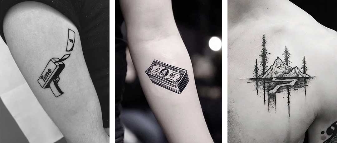
To get the answer to that question, we test the images and videos to figure out which one has the best click through ratio and is the most attractive to your prospective customers.
We do that because we found out that there’s a massive difference between one creative and another. And when I talk about a ‘creative’, I mean a piece of media (video or image) or piece of text.
For the purposes of this article we are mostly dealing with images and videos, but the things we test can also include the text, the headlines, descriptions, as well as a Call To Action.
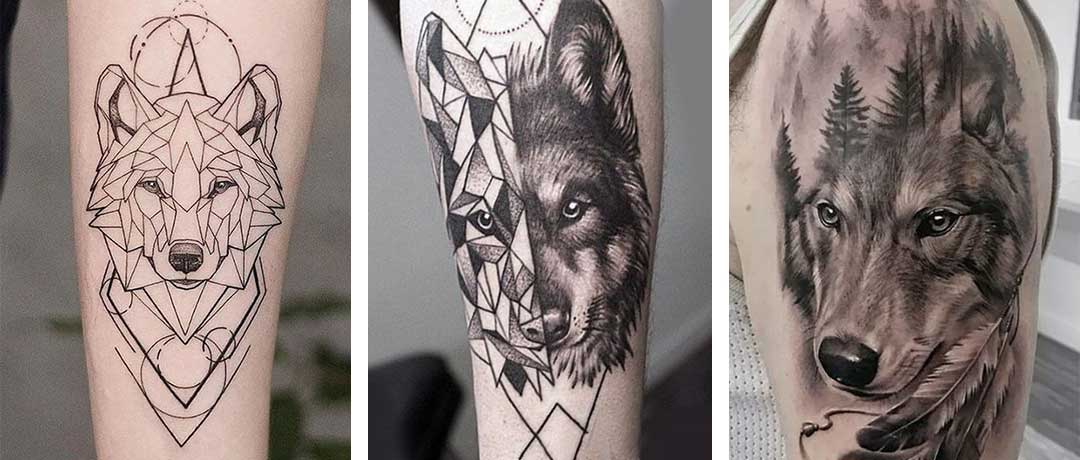
The testing that we perform is called multivariate testing and it is a super important part of our marketing strategy to get you the results you deserve and need.
Let’s see an example of that… I hope that it wasn’t too confusing, but we’re just going to see right now what I mean by everything I just explained. Go ahead and play the video below
Video: Multivariate Testing For Tattoo Studio Social Media Ads
Multivariate Testing
Okay, let’s see the crucial step that we need to take in order to be able to create the best performing ad creatives and landing pages.
Picking The Best Creatives
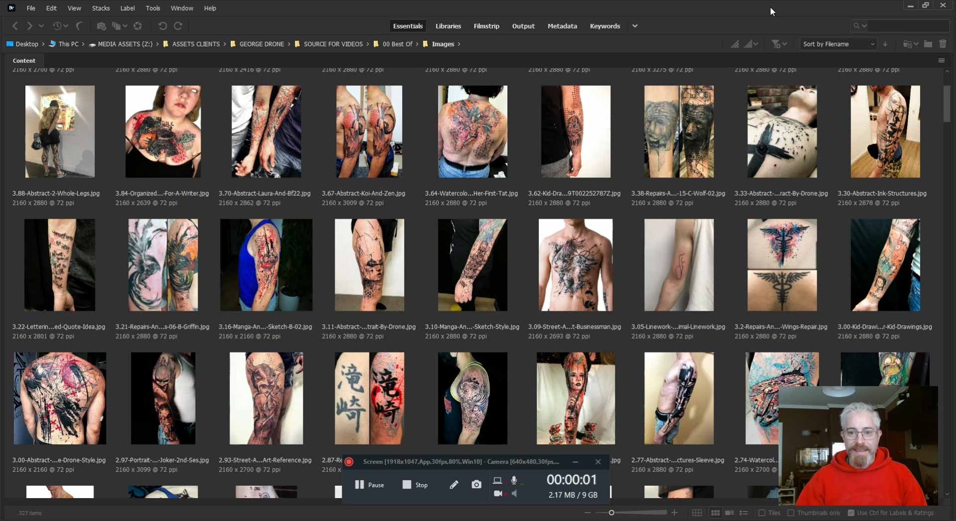
Now, when we start working with a new studio or tattoo artist, we start out with a whole bunch of creatives. So that’s images and videos that we get from the artist or the studio of the tattoo work. So in this example, what we’re seeing right here in front of us, these are 357 images that we’ve been sent by one of our customers. And we also have about 100 videos that he sent us.
And we want to use these to run ads. And the question is, as you may imagine, which one out of all these creatives are we going to use? Like, there’s so many. And that’s what we want to answer. So we’re going to test it, and we use a process called multivariate testing to do that.
Analyzing the Metrics
So we load this all up into Ads Manager and into our platform that we use for this testing, and we do what we need to do so that we can figure out which one performs the best. So check this out. We’ve got two really important metrics here. We’ve got the outbound clickthrough rate that’s over here and the cost per outbound click. Now, both of these kind of correlate, so they’re both really important.
Outbound CTR
The outbound clickthrough rate, basically, it means out of 100 people, how many people clicked on this ad when they saw it with this particular image? So here this example. Out of 100 people, about eleven people clicked on it. And if you look down here, out of 100 people, about five people clicked on it. That’s what the 5% means.
So the higher up here, the better it performs. Now, if you’re familiar with online advertising, these are really good click through rates to have. For example, in the case of this image here, we’re essentially paying $0.09. That’s 9 cents for a click to our landing page, and that’s also a very nice and low cost.
Cost per Click
Now, when we look at what the highest cost is on the other end of the equation, let’s sort that differently, then we got a very different situation. This is $7.70 in order to get a click. So that’s crazy. That’s a massive difference. In practice what that means is that it’s like the difference between let’s say that you’re getting a customer, you’re getting somebody to visit your landing page and fill in the form and book a tattoo with you for $50 if you’re using these best performing ad creatives.
And on the other end, you’d be spending about $4,000 in order to get a customer. That’s how big a difference we’re talking. It’s a factor of around 80. So the best performing creatives are performing 80 times better than the worst performing ones.
Test, Test, Test
If we didn’t test that, we wouldn’t know, and that’s why it’s so important to do this testing. It’s a lot of work, it takes a lot of organization, and it also costs some money in terms of budget. But it’s absolutely worth it for the long term, for the great results that you’re going to get once you know what to use in your ads.
Benefit of Working with an Agency
Now, besides Facebook, we also use other platforms. We use specialized platforms that help us to do the kind of statistical modeling so that we know that the results that we’re getting are significant, that we’re spending the right amount of money in order to get results that we can trust that it’s not like a kind of fluke and that’s, let’s say, a benefit of working with an agency as opposed to trying to do it yourself.
That we know how to do this and we have access to these kind of platforms which are rather pricey. They’re too expensive for just a tattoo artist or studio to use on its own. We spread the costs over all our customers so that it works out pretty good.
Going Beyond Promoted Posts
So as you can see what we’re doing, it’s going far beyond just doing like a promoted post randomly. That’s what most artists do, and sometimes you can have good results doing that, but that’s not going to work if you want to get a steady stream of low cost results, bookings 24/ 7, 365 days a year. If you want those kind of results, you’re really going to have to go beyond just doing random promoted posts now and then.
So you’re going to have to be a lot smarter than that how you go about this.
Essentially what it comes down to is that we test the elements that go into the ads that we create for you so that we can:
- Find the best performing creatives from among the images and videos that you provide us.
- Make faster decisions about which ad creative to scale and which to turn off.
- Track the click through rate, cost per action, conversions and more.
- Aggregate these results to pinpoint the trends that we’re seeing in the data.
Using the right budget, the right targeting, and the right methodology, we remove the bias from the creative process by backing all the decisions with conversion data to build better ads faster. Over time, we acquire historical creative intelligence that informs all of our ad creative decisions.
Tattoo Ad Examples for Social Media Platforms
Now let’s look at the ads that we create after all this testing. We’ve created a series of slideshows using the best performing videos and images.
In general videos tend to perform best as opposed to static images. In any case, in the ads we show the video segments and pictures in the order of which performed best during our testing.
Video: Tattoo Ad Examples for Instagram and Facebook
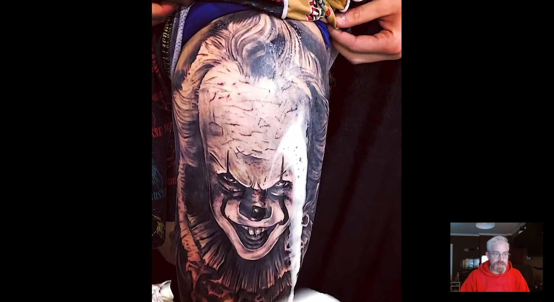
Alright, let’s take a look at some of the ads that we’ve created after all that testing. In general, we tend to use a video content as opposed to static images in the ads that we create because those perform better, but not exclusively. As we said, we test it and we see what works best.
“Best Of” Compilation
So let’s just look at this compilation here. This is a “Best Of”. So the best performing videos and images. We just put them all into one video and it’s different styles. A few images of the artist as well, a few videos rather, and some nice transitions. I’m just going to let it run. Okay, so that’s the “Best Of” compilation, and in this version, there’s no captions, it’s just the content. It just runs it’s a bit of a slideshow and that’s it.
Captions and Reviews
Now let’s look at a different approach. So here you can see a few different things. There’s some captions, some elements. And in this case, we show some of the tattoo content, and then about halfway through we show some reviews – that’s kind of social proof and trust building.
There’s some more captions with useful information and a review, and that starts here. So here are the reviews. They just come pretty quick. Here we show that he has an average rating of five, 5000 satisfied customers, and here’s a video review. So that’s kind of a different approach.
Portrait & Vertical Aspect Ratio
That is in a portrait aspect ratio. We also have the same thing in a vertical aspect ratio. So this is what you’d see if you were watching it in a story or a reel. Slightly different same content.
Different Ending Screen
And we have more approaches as well, more variations. This particular one is about animal portraits, as you can see, and it has a slightly different ending sequence. We don’t have the video review, we do have the reviews, which are kind of the text boxes. And there’s a different call to action button. Similar mentality or philosophy, slightly different result. Oh we didn’t have the reviews in this one, my bad. But yeah, different call to action button, real quick, it just flies by. I’ll let you see it again.
Duration
We experiment with different durations. Anything from 15 seconds to one or two minutes. They work well, both of those can work well in different circumstances.
Music Choice
Now, when it comes to the choice of music, the music that we use, it’s handpicked from a selection of music providers that give us the full commercial rights in order to use the music because you don’t want to get a copyright strike.
Aspect Ratios
We export these in two different aspect ratios, the videos. That’s aspect ratio of 9:16 and 4:5. The 9:16 is basically the vertical aspect ratio, what you see here, that’s for use in stories and reels and 4:5 aspect ratio is what you see here and this is for use in feeds and the like.
Captions
We also use captions, as I mentioned. So those are… as you can see down here, one of the captions. This one is telling you what the style is. We also use captions towards the end in the kinda end screen. So over here, the 5000 satisfied customers and counting. And that changes as the video progresses. Different kinda again trust building things that we have to say and we have the Call to Action button at the bottom.
User Interface Overlap
One thing you want to watch out for is that the elements, the captions and the buttons, they don’t overlap with parts of the user interface. So on the actual platform where people are going to be viewing this, there’s different things that make up the user interface that may overlap. Let me just show you an example of that.
So here you can see that in Stories there’s this little section here, the swipe up, learn more kind of button in Reels and in TikTok as well. These parts of the screen are taken up by user interface elements, as are these. Same goes for Stories up here. So you want to make sure that your captions and your ‘Call to Action’ buttons and all that don’t overlap with that.
Conversion Boosting Elements
And as I showed you in the ads, in the videos there’s these conversion boosting elements. These are the small snippets of reviews, real reviews by real satisfied customers that have gotten a tattoo with this particular artist. You saw how they appear in a kind of animated fashion. And we saw the ‘Call to Action’ button.
When I say ‘Call to Action’ button, I just mean a button. It looks like a button. It’s not a real button because you don’t actually click on it, but it just tells you what we’d like you to do. So it’s calling you to take an action, in this case to book your session now and as I said, there’s more captions which we are careful when we place them so they don’t overlap with the elements of the user interface. These and these, same goes over here. We don’t want to overlap with this stuff.
Landing Page Version Exports
Another thing to note is that when we’re exporting these videos, we’re also exporting a separate version which is for the landing page and that will be size optimized so that it loads really quick in order to play back smoothly on the website. Audio is not included in that version because that would increase the total file size. And it’s kind of annoying when you’re just browsing the web and something starts blasting music at you.
So we don’t include any music on the landing page version of the video and we’ll also export it in different file formats or use a streaming video service so that it really plays back as fast as possible once somebody gets onto the landing page.
Blog Post
Here on the blog post. You can see what we’ve covered today. You can read it, take your time, play the videos and, yeah, absorb all this information at your own pace. Hope you find it useful.
Tattoo Ad Examples
Choice of Music
The music we use is handpicked from providers that give us full commercial rights. You can’t just use any old commercial music for paid ads, you have to have the rights or you will get flagged and your ad will be rejected.
Aspect Ratios for Feeds and Stories
Notice how we have created two basic versions of the ad below. One version is in a vertical aspect ratio of 9:16 for use in stories and reels. The other is in a portrait aspect ratio of 4:5 for use in feeds.
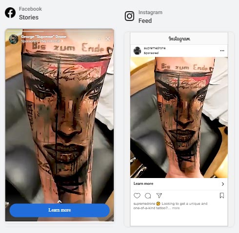
The portrait and vertical aspect ratio videos are the two basic ones you should have for your ads. You could also go for a square 1:1 aspect ratio in addtion to 4:5 and 9:16, or instead of the 4:5 version.
Captions
At Nextlevelbros we like to create some ads with captions, and some without captions. Then we test both to see which performs best.
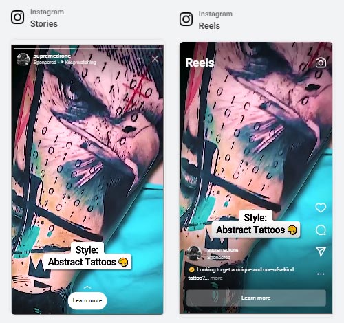
When using captions, you gotta be careful with where the caption actually appears in each placement, so that interface elements of the Social Media Platform do not cover or overlap your captions and buttons.
Different Versions for Instagram Stories, Reels and TikTok
If you are using captions, buttons, badges and other such elements in your ad, it might be a good idea to have one version of the ad for stories and then a different version for reels and for TikTok.
Stories and reels have interface elements that cover up different parts of the screen, as does TikTok, so you will want to ensure that there is no overlap of the user interface and overlay with any of your ads elements.
If it’s too much work to make those two separate versions, then make one version where you ensure that all ad titles and graphics steer clear of all possible interface elements, irrespective of platform or placement.
Conversion Boosting Elements
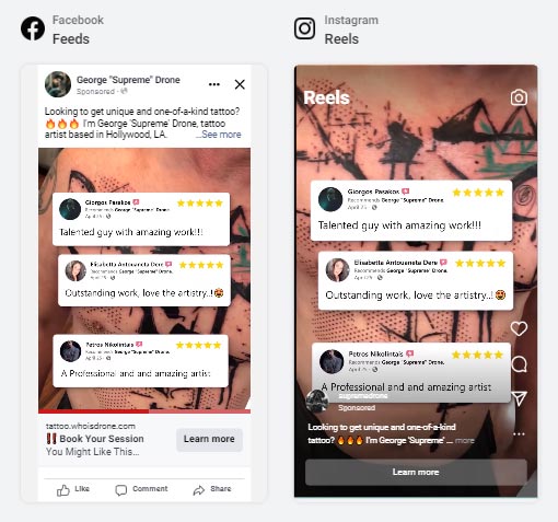
Besides using captions, we usually include various conversion-boosting elements in our video ads. These are text and images that help to convince viewers to click through and book a session.
Here in the example below you can see a selection of real reviews from satisfied customers as it appears in an ad.
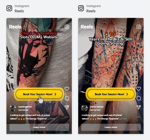
We also use a call to action in the form of a button. Optionally there may be some additional titles and badges appearing towards the end of the ad.
Landing Page Version
The Landing page will need its own special version of the video ad. This version has to be size-optimized so that it loads really quick in order to play back smoothly on a website.
Audio is not included in this version because that would increase the total file size of the video. Plus, music is usually kinda annoying when you’re just browsing the web, if something just starts playing music at you. So we do not include any music on the landing page version of the video.
Landing Page Streaming Formats
Finally, we export the video file in different file formats so that it can play back on all sorts of different devices or use a streaming-video service provider to host the videos.
Landing Page Design For Tattoo Artists & Studios
Once you’ve done all the creative testing, you’ve created the ads, you got the audience targeting set up and you’re running your ads, people are going to be clicking on those ads so you’ve got to have somewhere to send them to.
If you just send them to a regular website or a booking form, you will get some results, but you won’t get the best possible results.
We want the best possible results. So what we do is we create a custom landing page that’s totally optimized in order to get results. So let’s check out our conversion optimized Tattoo Artist Landing Page example.
Video: Landing Page Analysis
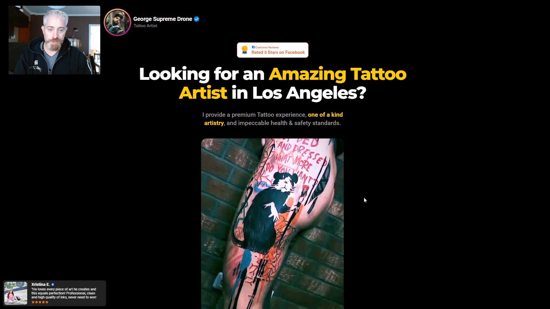
So once you’ve done your creative testing and you’ve created the ads, you’ve got the audience targeting set up and you’re running the ads, people are going to be clicking on those ads and you’ve got to have somewhere to send them to.
If you send them to a regular website or a booking form, you’ll get some results. You won’t get the best possible results and we want the best possible results. So what we do is create a custom landing page that’s totally optimized in order to get those results. So let’s check out our landing page right here.
Optimized Videos
So first things first. We did all that creative testing and we use that in the ads, the videos and the images in the order of best performance. But we’re also going to use it here on the landing page so that’s, as you can see, taking up a large part of the page of the above the fold area, we have our video.
Further down on the landing page, we also have here another compilation, different than the one above, but also some of the best performing creatives as well as the best performers by category. You can click left and right with the arrows or swipe.
So according to the different styles that the artist tattoos in, we’ve got the best performing creatives lined up in these videos.
Instagram Profile and Story Section
So heading up back to the top, starting up here, we have an image profile picture. Essentially it looks like an Instagram verified profile kind of badge.
And when you click on it, you can actually see some stories. We’re going to check that out later. And then we have a badge here. This is a social proof badge telling people that, you know, this artist is a rated five stars on Facebook, which is pretty good.
The Headline
We have our headline, main headline which answers or just talking to the people who clicked on the ad. They’re in Los Angeles for the most part or in the area around there. So that’s why we mentioned that in the headline and in the subtitle we talk about some other things that people are interested in when they’re picking a tattoo artist, the health and safety standards and the artistry.
Call to Action Button
Moving on, we’ve got our main Call to Action button. This takes you to the booking form when you click on it little arrow.
The Arrow
You may think it’s a bit much, but trust me, a visual indication of where you want people to click on can only help. And so we’ve got that as well.
Contact on Instagram
In this case the artist asked for us to give people the option to message him on Instagram. He doesn’t mind receiving messages there. So we have that option.
Reviews Social Proof
And then we continue down here with some more social proof. We have this bar that’s again, reiterating the 5.0 rating based on 33 reviews. And we have some more profile pics over there.
Trust Building
Then we have here another trust building section talking about 5000 people who are already rocking a unique tattoo. And we have logos of the artists of the studios working at of a company that sponsors him.
So this is all, let’s say trust and authority building. Beyond that or below that rather. We’ve got more. We have here badges that show that this is a popular artist on social media. Also a trust building and social proof building thing to show.
Introductory Text
And then a bit of introductory text about artists, about his style, his background. And then we hit some more trust building icons. These are various magazines that the artist has been featured in. So we have that as well.
More Social Proof
And then we have some more social proof. This is a review. You can see down here there’s also a social proof notification that comes and goes that will either show people who have booked in the past or it will show people’s reviews. You’ll see that pop up again in a second here. We just checked this out a little while ago. This is the carousel, video carousel with the best of videos.
Reiterate Call to Action
And as we go down, we constantly reiterate the call to action. You know, you may think it’s a little annoying or cheesy to have the button with the throbbing animation and the arrow as we saw before, but trust me, there’s just so much stuff out there that can distract people and it’s fighting for their attention.
It could be other social media, other things to do, real life things, family, friends, phone calls, delivery guys at your doorbell ringing. So you also really got to try to hold their attention here and get them to make that click.
Review Carousel
We have an animated review carousel and then we go to the image portfolio.
Portfolio Image Carousel
So in this case, let me use my little marker there talking about this here. In this case it’s not video, it’s just static images. But they are again according to the order of best performance.
When you click on it, you get a zoomed in version. This is called lightbox. Super important to give people the option to check out the details on tattoos.
Social Wall
We have here another little bit of text that is convincing people to take action. And we have the social wall. This pulls straight from the artists social media page. And these are his latest posts. You can see what he had to say about it. Get a little bit of feeling for the artists voice. This is actually a way that he can partially control some things that are on this page and people to see his latest work without us as an agency having to go and make changes to the page.
“How Does it Work” Section
Super important section here: “How does it work”. This explains everything to do with the booking process. Again, the Call to Action button is there. Of course, we talk about booking, timeframes, costs, all that kind of stuff.
Pricing Section
Further down we get into the cost, more specifically, the minimum fee, day rate, half day rate and deposit covered in a bit of depth, so that if you want to know that, it’s here and we tell people that the best way to get a specific price is to contact the artist.
FAQ
Here is the “Frequently Asked Questions” section. This is made in the form of stories, just like on Instagram. So you click on it, you get the little story, it times out, it flips to the next one, and there’s a Call to Action button as well. Really cool functionality. This is actually the same that you get when you click all the way up at the top of the page. Same thing.
So pretty cool way to have the Frequently Asked Questions appearing. Let’s go back down here.
Celebrity Clients Carousel
Here we have another image carousel. Again, some trust building information there. And this is actually a section with some celebrity clients which yeah, it is absolutely an authority and trust building measure to show that people who are somebody known out there in different scenes have trusted this artist with their tattoo.
Repeat Headline
Some more reviews and then we have a section that kind of repeats what we had at the top, above the fold, only with a slightly different headline and subtitle this time. We’re trying to get people to book their session. There’s a little bit of time pressure there.
We have all the social proof at the bottom below that.
Feedback Form
This is a form, it’s a feedback form. So basically, aside from just making this page, we’re actually asking people if they found the information they’re looking for, if there’s something missing on the page that they were looking for. This is a form that helps us improve the page by getting feedback straight from real people who are visiting here.
Animated Review Notification Pop-up
By the way, you can see here the reviews I was telling you about.
You can also close the notifications if you’re a visitor. If you find it annoying or too much, you can just click that away.
Footer
Then we have another review and then the a footer.
Landing Page Summary
So this is the entirety of the landing page, having all these elements which inform and persuade the user.
Essentially, what we’re doing is instead of having somebody visit your website, visit your Instagram page, visit your Facebook page and all these different places, visit your YouTube and then message you and do all these different things to try to get information about you as an artist to see if they want to book.
We put that all into one page. So that all someone has to do once a year is basically just scroll down and that’s it.
The Landing Page
The landing page contains a variety of sections and elements, each of which has a role to play in either informing or persuading the visitor, in a smooth, frictionless and enjoyable way.
Watch the video above for an in depth discussion of each element.
Essentially, what we’re doing is instead of having somebody visit your website, visit your Instagram page, visit your Facebook page, visit your YouTube and then message you , doing all these different things to try to get information about you as an artist to see if they want to book. We put that all into one page.
So that all someone has to do is basically just scroll down, absorb info and take action -that’s it.
Landing Page Elements:
Our main headline talks to the people who clicked on the ad that leads to this page. In this case, we are talking to people in Los Angeles or in the Souther California. So that’s why we mentioned the location in the headline. In the subtitle we talk about some other things that people are interested in when they’re picking a tattoo artist, the health and safety standards and the artistry.
The first Call to Action button is a must have feature. People are more likely to take an action when you ask them to do so so we use imperative wording to the effect of ‘take X action’. The button takes you to the booking form.
We usually place the booking form on a separate page that you get to once you click on the CTA button, but the form is nonetheless a vital and integral part of the landing page and the user experience of visitors who arrive at our landing page. For more info see the seperate section we have further down on this page that deals exclusively with the booking form.
In this case the artist asked for us to give people the option to message him on Instagram. He doesn’t mind receiving messages there, so we give users that option. Usually though we do link away from the landing page this high up on the page. Try to keep people on the page or direct them to the booking form.
This is a visual indication that points towards our Call to Action button. You may think it’s a bit much, but trust me, a visual indication of where you want people to click on can only help.
At the top of the page we have an profile picture and title section that essentially looks like an Instagram verified profile badge. This is a familiarity trigger that most visitors will be have seen before on Instagram.
We did all that creative testing to figure out the videos and the images in the order of best performance. Besides using that in the ads, we also use it on the landing page. The optimized videotakes up a large part of the page of the above the fold area.
Further down on the landing page we have a video carousel where we use some more video compilations. These are different than the main compilation video at the top of the page, but also feaure some of the best performing creatives by category or by artist.
These awards badges are a trust building trigger. Awards show that the artist is both known and appreciated in the wider tattoo world, this generates trust in prospective customers.
Reviews are the one of the best forms of social proof. We various badges, bars and sections that reiterating the 5.0 rating based on 33 reviews (or however many the artist or studio has). We include profile pics of the people leaving the reviews, that lends an air of autheticity. We also talk about the 5000 people who are already rocking a unique tattoo by the artist.
We have an animated review carousel that cycles through 30 real reviews that have been left by real clients.
These are small animated pop ups that appear in the bottom of the page at set intervals. They are attention getting and informative, but the users also easily close these notifications If they find it annoying or that it covers too much of the screen.
There are text sections at regular intervals throughout the landing page with specially selected reviews that we feel protrays the artist in an especially positive light.
Near the top of the page there is a small section of introductory text about the artist/studio, about the artist’s style and background.
We make extensive use of trust building logos. We feature the logos of various magazines that the artist has been featured in, and we have logos of the studios the artist is working at and the logo of a company that sponsors the artist.
This seconds carousel feature static images. But they are again according to the order of best performance. When you click on an image, you get to see an enlarged zoomed in view. It is super important to give people the option to check out the details on tattoos.
Another image carousel this one contains pictures of celebrity clients which is absolutely an authority and trust building feature that shows that people who are ‘somebody’ out there in a specific scene have trusted this artist with their tattoo.
And as we go down the page, we constantly reiterate the call to action at regular intervals. You may think it’s a little annoying or cheesy to have the button with the throbbing animation, but trust me, there’s just so much stuff out there that can distract people and it’s fighting for their attention. It could be other social media, other things to do, real life things, family, friends, phone calls, delivery guys at your doorbell ringing. So you also really got to try to hold their attention here and get them to make that click.
These badges show that this is a popular artist on social media, displaying their follower count in the form of an eye catching badge. This is one more social proof trust building feature.
The social wall pulls straight from the artists social media page and displays the latest posts. You can see what he had to say about each post in his own words and get a little bit of feeling for the artist.
This section explains everything to do with the booking process. The Call to Action button is repeated here of course. In this section we talk about booking, timeframes, deposts, all that kind of stuff.
Further down we get into the cost, more specifically, the minimum fee, day rate, half day rate and deposit covered in a bit of depth, so that if you want to know, it’s here. We also inform visitors that the best way to get a specific price is to contact the artist through the booking form.
The FAQ section is in the form of Stories, just like on Instagram. You click on the icons and you get the little story. The story flips to the next one once it is done, and there’s a Call to Action button as well. This is a really cool and eye catching functionality.
This section kind of repeats what we had at the top, above the fold, only with a slightly different headline and subtitle this time. We’re trying to get people to book their session. There’s a little bit of time pressure applied here.
We are actually directly asking visitors if they found the information they’re looking for, if there’s something missing on the page that they were looking for and for any other feedback they may want to add. This is a form that helps us improve the page by getting feedback straight from real people who are visiting here.
All the way at the bottom of the page, the footer is the only section with links out to the artists or studio main website and social media.
Conversion Rate Optimization & Heatmaps
We optimize the conversion rate of the landing page using click maps and session recordings. See the video below for an in-depth explanation.
Video: Landing Page Conversion Rate Optimization
Conversion Rate Optimization
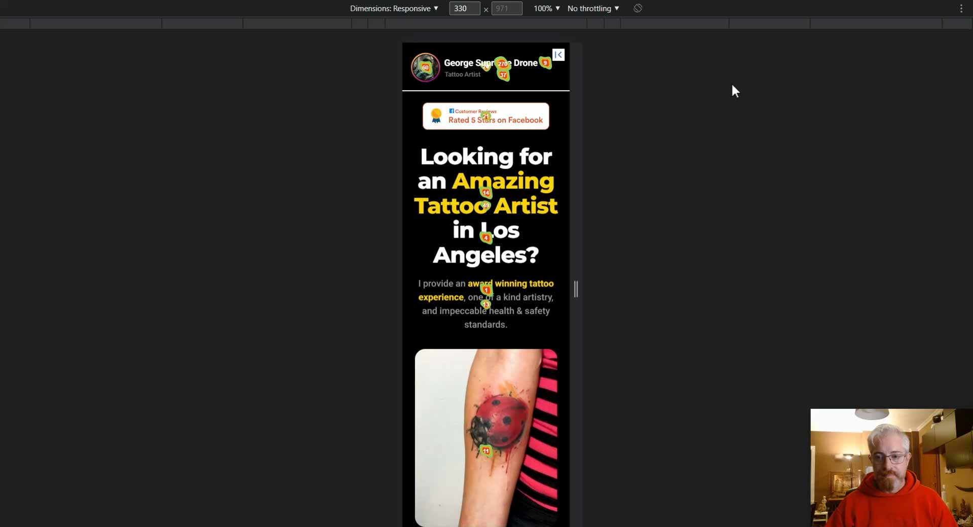
I’m now gonna show you and explain to you how we optimize the conversion rate of the landing page using click maps, heat maps and session recordings. So what it comes down to is that we analyze user behavior to see how people are interacting with the landing page, to analyze what’s working and what’s not working, and to essentially drive our decision making and theories with regards to what kind of changes we want to make to the landing page, if things that we have done are working, if it’s a positive or negative change. So this is all something that can be analyzed and you don’t have to just leave it, let’s say, to a random hunch. So what we’re looking at here, for example, is a click map.
Page Interaction Overview
Now I’m going to switch for a second to another page over here, and here we can first see a kind of overview of the clicks that take place on this page. I can see certain stats, like if it’s, let me show you. I can see if it’s a desktop or mobile or a tablet device that’s making those clicks. I can see if it’s coming in from… Which page it’s coming in from, and if there is some kind of UTM parameter that’s appended to the URL, that kind of helps me to know also the traffic source. And I can see various statistics which will interest me to help me analyze the situation.
Click Map
But the most interesting of all is this here click map. So let’s see what we’ve got. I can see all sorts of things. These little green and red blobs with the numbers. These are places that people have been clicking over here and over here and over here and so on. All these little blobs, those are places that people are clicking and the number is how many times someone has clicked.
Interacting with Profile Icon
So I can see for example that people are clicking on this little profile icon. That’s cool. And I have actually, based on that insight, actually went and added a functionality there whereby if you click on it, you get a kind of stories interface with Frequently Asked Questions.
Interacting with Headline
Now I see that they’re also clicking here on the title, on the name. So an insight could be that, you know what, I should put the link here as well onto the text because lots of people are clicking there.
Interacting with Main Video
Moving down, I can analyze and understand other things about the user behavior. Now eleven people have clicked over here on the video that actually starts and stops the video. If you want to do that. 47 have clicked on the Call to Action button. That’s right here, so I can see that.
Interacting with Sticky CTA Button
Let’s keep moving down, scrolling down. Okay, so there is this sticky Call to Action button up here with a button and 356 people have clicked there. So that’s telling me that, hey, this is really good, it’s a great idea that I’ve put it there because a lot of people are actually clicking on it and going to fill in the form and using that specific button. So that’s a great insight that I’m having. I can see other stuff. I can see that people are clicking on these icons here.
Insights That May Lead to Changes
These don’t actually take you anywhere. Same goes for these here. So I might put in a link, I don’t want to send people off the site. So I might put in a link to another part of this, an anchor link to another part of the anchor page, of the landing page I mean. That’s an idea that I might draw from what I’m seeing here. Let’s keep on moving down.
Interacting with Video Carousel
Here we have the video carousel. Now I can see that some people are clicking on this text here that doesn’t actually do anything. But the good news is that let’s say about 1500 people are clicking on the little interface here. You can’t actually see but there’s some arrows to go left or right and some buttons that help you navigate. So people are definitely swiping left and right here on this video carousel. So that’s really working. That’s awesome.
Interacting with Second CTA Button
Keep on moving down. Let’s see. Okay, I see that another 47 people have clicked on this Call to action button. So that tells me, you know what, it’s good that I put it there. I’m getting a few more click throughs just from that alone.
Insights Confirm or Disprove Theory
So all these interactions that people are having with the page, they’re confirming or disproving a theory that I may have about how people are interacting with a page and they may guide me to make changes or to leave certain things the way they are.
Session Recordings
Now, besides the… what you see here, the click map, we also have session recordings. Let’s take a look at those. These are interactive recordings -anonymous – of specific users. So I don’t really know who it was that came here, what their name is or anything like that, but I can see how they were interacting with the website, with the landing page.
Now here you see a 403 error for this video. That’s just because the video is hosted on a content delivery network and it’s in an iframe, and the recording system doesn’t record that, but the user, him or herself does see that video. So don’t worry about that. And if we just play, we can see, okay, the user arrived here. Now they’re taking a look at this first video for a duration of a couple of seconds.
It’s actually about 15 seconds. So that’s already… I’m just going to pause that real quick. That’s an insight, that video, somebody’s watching it for 15 seconds, maybe that’s a good duration.
Now moving on, the person slowly moves down the page. They’re reading various parts of it. All of this, let’s say, confirms to me that people are absorbing the content that’s here now they stopped for a while. They’re viewing this video or they’re reading this text and so on.
Session Recording Aggregate Data
Now, coming here to the page where I have the aggregate data about the session recordings, I can see interesting statistics like the average session duration which shows me for example here on the 5 December the average amount of time people were spending on the page is 1 minute and 47 seconds. And these are all interesting little stats for me in my attempt to understand how people are interacting with a landing page.
Feedback Form
Now, all that information that I’m getting from the click map and the video recording sessions, I combine it with information that I’m getting from this feedback form down here, where people let me know how their experience was with this page to give me a kind of total impression of how it’s performing.
A/B Testing
So the landing page, it’s not a static creation that just sits there, it’s in constant development. And of course, if something works, I don’t want to break it. So what I’ll do is I may test, do a kind of A/B testing, using an A/B testing functionality to test two versions of the landing page to see which one performs best.
CRO is a High End Service
And carrying this all out, all the conversion rate optimization, the tracking, the heat maps, the click maps, the form, that whole combination of ways to analyze the page, it’s a specialized skill, not only to set it up, but to be able to understand and interpret and draw useful conclusions. So it’s a bit of a high end service that we optionally provide to those customers who are really willing to take it to the next level.
Data Driven Decisions
At this point, this specific landing page is already very well optimized. It doesn’t require that many changes, but it’s good and it feels good. And it’s reassuring for me and my customers to know that we’re making data driven decisions.
Conversions Matter Most
Of course, at the end of the day, the results, the people who are booking and coming and getting tattoos in this case, are what matter the most. And that’s the final piece of data that confirms or refutes any decisions when it comes to the landing page.
Analyze User Behaviour
What it comes down to is that Using CRO tactics we can observe user behavior to see how people are interacting with the landing page, to analyze what’s working and what’s not working, and to essentially drive our decision making and theories with regards to what kind of changes we want to make to the landing page.
Clickmap Inisghts
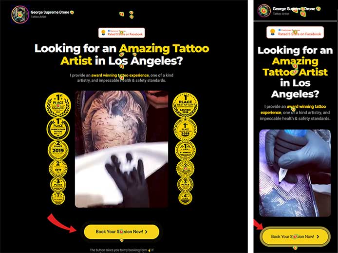
By analyzing the clicks on the mobile version of the landing page, as we can see in the video above, we can observe the following:
- 21 visitors clicked to close the review notification pop ups. That is a noticeable amount but not so high that I would deduce that it is irritating to a large percentage of visitors. We will keep the reviews notification on for the mobile version of the landing page.
- Visitors are clicking on the sticky CTA bar, so that is useful functionality to have and definitely worth keeping.
- Visitors are clicking on the profile picture at the top of the page, expecting some kind of functionality there. That is why we added the stories FAQ functionality.
- Visitors are also clicking on the Instagram profile username. Maybe we should put a link in there as well to launch the FAQ stories.
- Thousands of people are clicking to view the video carousel, this confirms to use that this is a menaingful and worthy section and functionality on this page.
- Some people are clicking on the video carousel caption. Conceivably we could add a notification message when that happens that informs people that they should scroll the carousel instead of clicking on the caption.
- Visitors are clicking on the second CTA button in large enough numbers to consider this a successful and necessary section of the landing page.
And so on, there are many insights we can draw by analyzing the clickmap.
Data Driven Insights
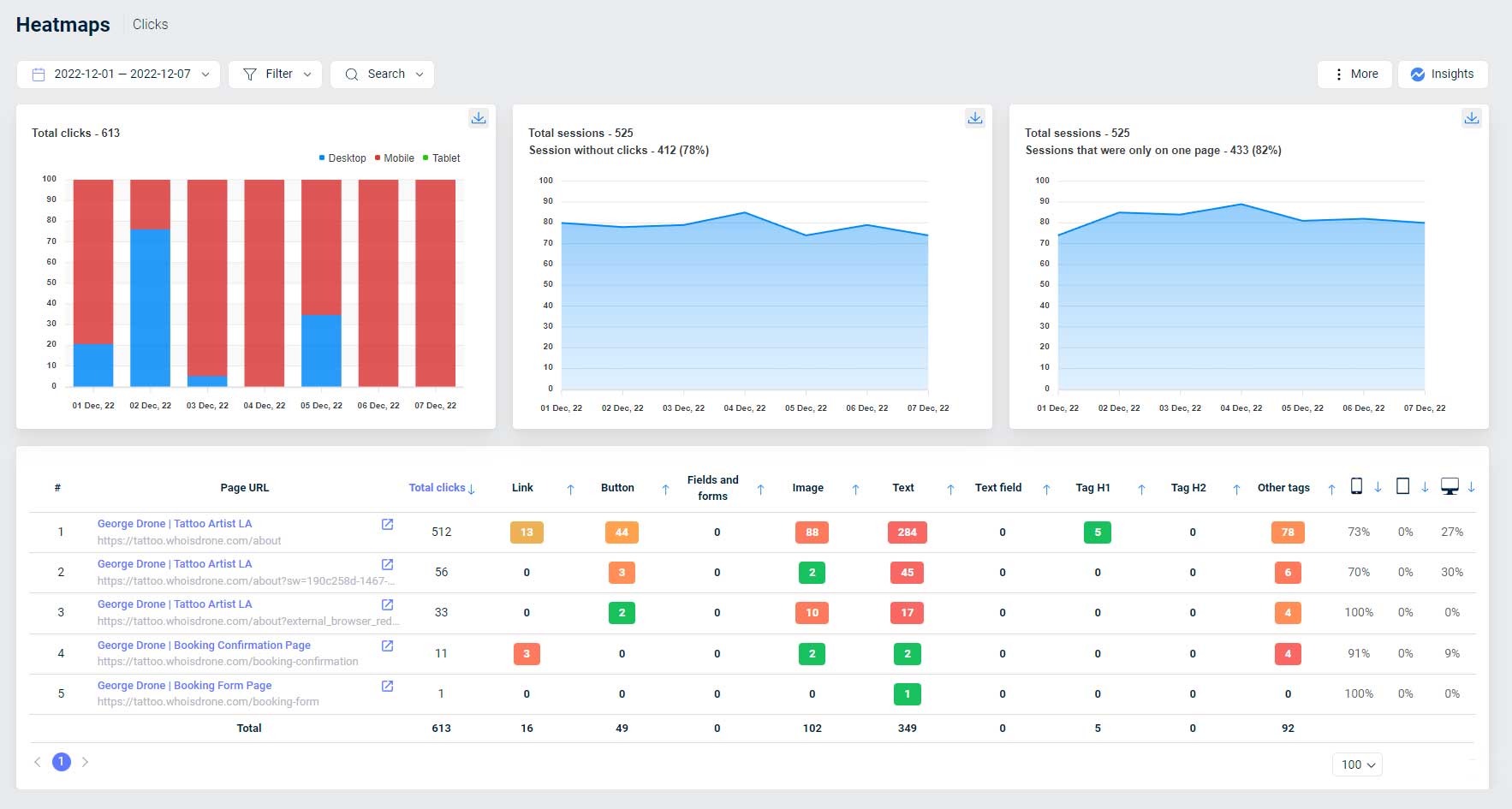
The clickmap insights are combined with session recordings and the feedback form at the bottom of the page to guide us in making decisions about the design, layout and features of the landing page. So the Landing page is not a static creation that just sits there, it is in constant development.
A/B Testing
If something works well, we do not want to break it. We can test changes using A/B testing functionality to test two or more versions of the landing page.
Doing this type of testing is a specialized skill, not only to set it up, but to be able to understand and interpret and draw useful conclusions, so it is a bit of a high end service that we optionally provide to those customers who are really willing to take it to the next level.
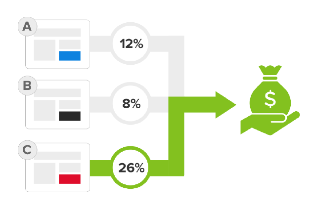
Conversions Matter Most
Of course, at the end of the day, the results, the people who are booking and coming and getting tattoos in this case, are what matter the most. And that’s the final piece of data that confirms or refutes any decisions when it comes to the landing page.
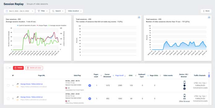
At this point this specific Landing Page is very well optimized, and does not require many changes, but it is good to be able to test and be making data driven decisions.
Landing Page Monitoring of Uptime and Performance
Once you have created your ads and your landing page, and your ads are actively are running on Social Media, you will want to monitor your Landing Page. Specifically you want to monitor if and when your landing page ever goes down, and how it performs.
So let’s see how this can be configured and talk about the various types of monitoring that we can use.
Video: Landing Page Uptime Monitoring
Keep an Eye on Things
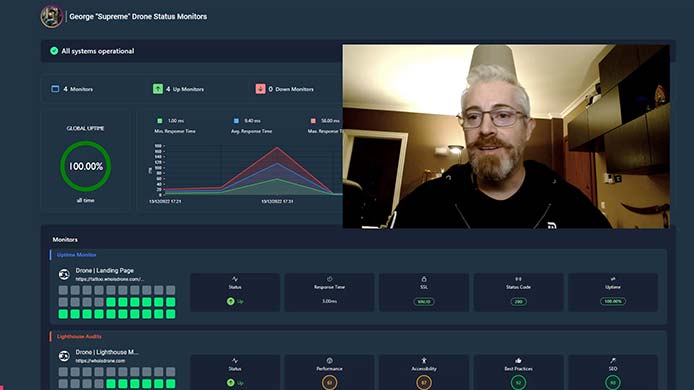
So once you’ve created your ads and your landing page and your ads are running on Facebook, Instagram and TikTok, or any one of those, you will want to monitor the situation. Specifically to monitor if and when your landing page ever goes down and its performance.
How this usually works is you set up a monitoring process and set up notifications so that you will know when your website goes down, and you can set it up to receive an email or Slack notification whenever your website goes down for too long, or if any parameter is outside of your desired range.
We can also set up status pages where we and our customers see in real time if everything is up and running. So let’s see various types of monitoring that we can use.
Uptime Monitoring
Uptime monitoring is the most important thing that you want to be monitoring on your landing page. That’s essentially telling you if the website is alive, if it’s accessible on the internet.
So you can go ahead and.. there’s many services that you can use to create a monitor. I use this one and you can go ahead and create one. You enter the… let’s get that URL. So you enter the URL over here. Give it a name so you can recognize it.
Uptime Settings
You want to have a fast interval, so 1 minute is pretty good because you want to catch it, even if it’s going offline for short periods of time. You want to be aware of that.
Locations
Then there’s some more detailed settings here in the request you can check from specific locations you might want to set up from different continents. If your website is accessed from different places around the world.
Duration
This you can either use Get or Head. If you have this option, don’t worry about it if you don’t know what that means. Here it’s asking you, how long do you want me to wait before I consider that this website is down? So it tries to access the website, and if after 30 seconds there’s no response, then it’s considered down and you can increase and decrease that. I’m going to leave it at 30 seconds for now.
Amount of Checks
And here it’s telling you, you know what, consider down after X amount of checks. I’m going to leave that at three checks.
Prevent Redirection
I also want to prevent a redirection, so I don’t want it to be considered that it’s still alive. If I try to access the website and it redirects, maybe to some kind of error page of the hosting, I want to consider that down.
DNS Settings
I’m just going to use this DNS. It’s a Google DNS. And here are some status codes that this monitor can recognize as being either up or down. Down, meaning non accessible.
Notifications
Notification settings are where I want to receive a notification when the site is down. So on my email and I can configure some integrations, as you can see Slack, Discord, et cetera.
SSL Certificate
And also I can get a notification to know when the SSL certificate is about to expire.
More About Notifications
So these are all pretty useful features for an uptime monitor. I’ve already created some of these, so I’m not going to create that one again. In any case, what you want is to be able to come to your status page and see how things are going and of course get a notification in your email or your Slack or whatever you have set up in order to receive the notification.
So in my case, I just prefer to get that in my email. I check my email pretty often and that’s okay. But you may prefer Slack or Discord or something else and that’s pretty much what it comes down to.
Other Monitor Types
Now there’s a whole lot of other types of monitors that you can set up.
Network Monitoring
For example, network monitoring that sees how long it takes your pages to load. That’s something. Of course you should have checked that when you’re actually developing your page, but it’s good to know that nothing has changed in that respect.
Text Monitoring
You can do ping monitoring, you can do either text or screenshot monitoring. That’s pretty useful, and I do use that. So what I do is I come here and I say, you know what, I want you to check if the site is up, but I want you to look for certain words.
So for example, look for this sentence. And if you don’t find this sentence, that means that something’s wrong. So perhaps the website isn’t totally down, but it’s not loading the page correctly, so I want to know that.
Screenshot Monitoring
And a screenshot can have a similar functionality. It can also tell you if something’s changed. So it could be that some thing has been updated in your hosting or some plugin if it’s a WordPress site that’s causing the layout to change. And by using the screenshot monitoring, you can actually check to see if that’s happened automatically and get a notification. So that’s a pretty useful feature to have.
Lighthouse Monitoring
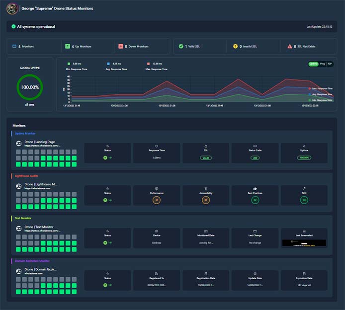
Now, a few other types of monitoring that I’ve set up on this specific page is Lighthouse. That’s a kind of SEO and performance check by Google. So I want to know if that has changed without me having edited the page in order to do something, in order for it to change, that means that something dodgy is going on. I’ve got my text monitor here, as I said, that’s actually checking to see if the expected text is on the landing page.
Domain Monitoring
And I’ve also got a domain expiration that just keeps me informed if the domain is about to expire. I don’t want that to happen.
Blacklist Monitoring
Finally, there’s also blacklist monitoring pretty useful as well, just to see if your websites are blacklisted. That’s especially important for SEO and for your own peace of mind. So it can help you know that you need to take necessary steps before being penalized or blocked by search engines. So if you appear on some kind of blacklist.
Summary
So I don’t want to get too in depth here. Point is, you do want to know and have set up some kind of monitoring for your landing page just so that you know it’s online, it’s live, it’s working as expected. It’s not on a blacklist. Nothing has been updated causing it to appear wonky, and once you know these things that you’re covered as far as monitoring is concerned.
So that’s about it. A lot of people don’t bother with this step. I like to, because I have found that over months and years, things can and do go wrong with websites, and you want to know about it first.
You don’t want to have a customer email you or call you or write to you and be like, hey, something’s wrong with your website. I tried to sign up and it wasn’t working, or I couldn’t access it. That’s embarrassing.
And when that happens, it’s probably been down for a while, and you just didn’t know. You may be sending ad traffic that you’re paying for to the site, and you’re wasting money.
And it’s also, for me at least, I feel that it hurts your reputation for customers to see that happening. It’s not something that I want to see on one of my own websites.
So that’s the uptime monitoring.
How this works is that you set up a monitoring process and notifications so that you will know when your website goes down. You should also configure it to send you an email or Slack notification whenever your website goes down, or if any other parameter is outside of your acceptable range.

Monitor Types
There are many types of monitors you can use to keep track of your website status and performance. The most important is Uptime Monitoring, but we have used various other types as well.
- Uptime Monitoring
- Network Monitoring
- Ping Monitoring
- Text Monitoring
- Screenshot Monitoring
- SSL Monitoring
- Lighthouse Audits
- Source Code Monitoring
- Blacklist Monitoring
We also set up status pages where we and our customers see in real time if everything is up and running.
Booking Forms For Tattoo Artists & Studios
The booking form is an important part of the landing page experience. A badly developed booking form, one that does not provide a good user experience will result in a too-high drop off rate and end up costing you potential customers.
On the other hand, you do want to ask enough questions to cut down on the communication required afterwards, and to pass as much of the work of communicating as possible onto the customer instead of onto the tattoo artist or studio.
In this way the form also functions as a kind of filter, that filters out people who are not really interested and where perhaps going to waste our time.
Video: Landing Page Booking Form
The Booking Form
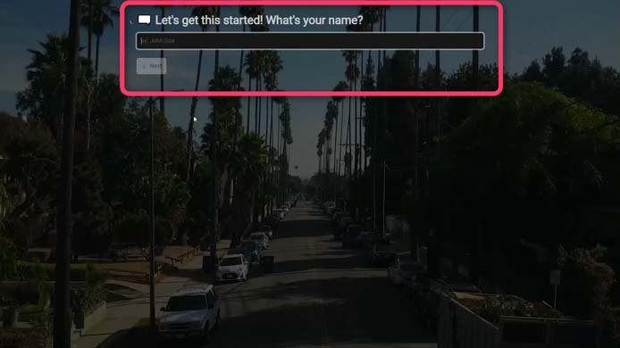
So taking a look now at what happens when somebody comes to the landing page and is convinced, wants to be a customer, so he or she clicks on “Book Your Session Now” that takes him or her to the booking form, that is here, and here we’ll collect all the information that makes it easier for the artist to get to know the customer and basically get closer to actually closing the booking and having him show up at the studio to get it done.
So you enter your contact info, some phone number, et cetera, email and so on.
Mobile Version
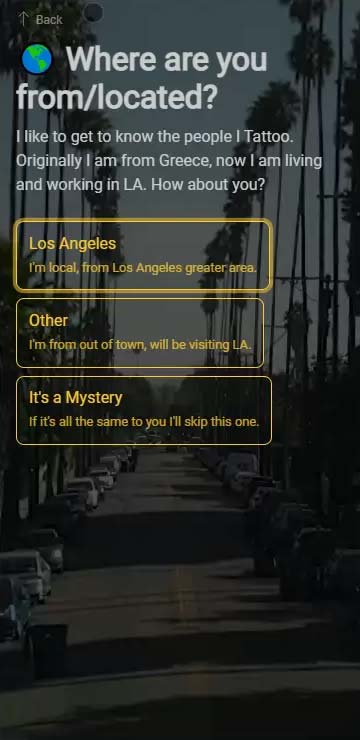
Actually most people are going to be coming here via mobile devices. So just so you can see that this is how it looks on a mobile device…
Building The Form
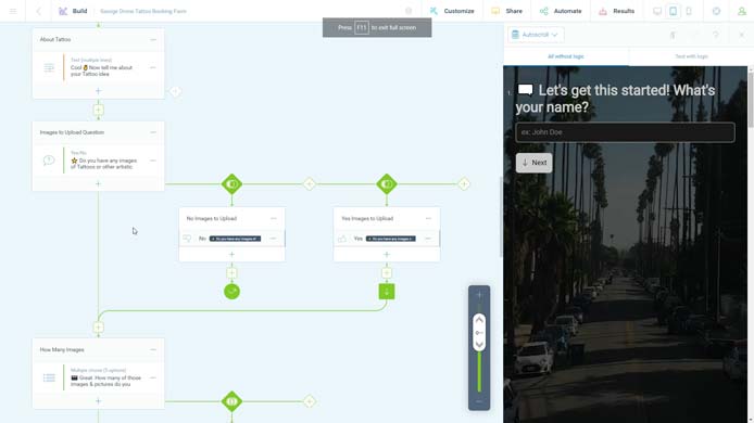
So yeah, just step by step gathering all the information that you need. And this is actually if you want to see the interface, this is where we build out the form with various conditional logic and options.
Form Confirmation
It’s actually quite extensive, and this all goes into an email that the customer receives as a confirmation, the artist receives it too and it goes into a spreadsheet or a CRM as well. So that’s the booking form side of things. And this has been working really well for us in our tattoo marketing campaigns.
Mobile First
We take extra care to ensure that the booking form works well on mobile devices. This means that:
- Text should be easily legible.
- Buttons are large enough to easily press with your fingers, even if you have big fat fingers.
- The form should not jank up and down when moving from one step to another as the screen keyboard pops open and closed.
- Include as much explanation, placeholders and tooltips as neccessary to make every step/question super clear.
- Use simple language so that it will be understandable, even to a visitor who may have an elementary school reading level.
- And of course the form should load quickly and smoothly.
Form Confirmation
Make sure to have proper Form Submission Confirmations. Send the customer an email with the submitted information, also send yourself/the artist/the studio a notification with the submitted information.
Agree with the artist or studio what the best way to recieve the info is. Depending on the circumstances, that may be via email, deposited into a spreadsheet or sent directly to a CRM platform.
Conversion Tracking For Tattoo Artist Online Ads
When running Social Media Ads, it’s necessary to be able to track the results so that Facebook or TikTok’s algorithm can optimize based on what is working well to get the desired results, and of course we also need to be able to see which of our ads are brining in the results as we will test more than one ad creative.
The tracking is a technical matter, we won’t go into great depth here about how to set that up because it is something that can best be implemented by your web developer or an expert in this field.
Video: Converstion Tracking Basics
The Booking Form
So taking a look now at what happens when somebody comes to the landing page and is convinced, wants to be a customer, so he or she clicks on “Book Your Session Now” that takes him or her to the booking form, that is here, and here we’ll collect all the information that makes it easier for the artist to get to know the customer and basically get closer to actually closing the booking and having him show up at the studio to get it done.
So you enter your contact info, some phone number, et cetera, email and so on.
Mobile Version
Actually most people are going to be coming here via mobile devices. So just so you can see that this is how it looks on a mobile device…
Building The Form
So yeah, just step by step gathering all the information that you need. And this is actually if you want to see the interface, this is where we build out the form with various conditional logic and options.
Form Confirmation
It’s actually quite extensive, and this all goes into an email that the customer receives as a confirmation, the artist receives it too and it goes into a spreadsheet or a CRM as well. So that’s the booking form side of things. And this has been working really well for us in our tattoo marketing campaigns.
I will go over a few key concepts of the tracking implementation, but the gist of it that you need to be aware that the tracking is something that needs to be enacted and tested before you go all out with your advertising campaigns.
In order for the tracking to work, it must be correctly configured on the landing page and connected to Ads Manager. There are two ways this is achieved. Both methods are complimentary, ideally use both at the same time.
- Client Side Tracking Pixel. You may have heard of the Facebook Pixel. TikTok and Google both have something similar. This is a code that is installed on your landing page that tracks and transmits user interactions to your Ads Manager.
- Server Side Conversion API. This is a different method of implementing the same functionality that the Pixel provides. Since many browsers block 3rd party scripts from executing or the sending of data to 3rd party URL’s, the Conversion API (CAPI for short) is a workaround that sends the interaction data from your landing page to your own server with your own URL. Since it is your own server on your own URL is it not recognized as a 3rd party tracking service but an an integral part of your website. From there, the server sends it on to Ads Manager or to wherever you want.
The main things you will want to track, in order of importance are the following:
- Form Submissions – When a landing page visitor completes and submits your booking form.
- Form Start – When a landing page visitor opens your form and starts to fill it in.
- Page Views – This is simply tracking when someone visits our landing page.
Results Reporting With Real-Time Structured Data
When we are running digital marketing campaigns for our customers, we keep them informed about the results.
Our customers are mainly interested in the incoming bookings, but it is nice to also have access to other stats such as cost per lead, ad spend, reach, traffic and so on.
Providing this information falls under the service we call “Reporting”. See the video below for more information about our reporting system.
Video: Tattoo Digital Marketing Reporting
Why Tracking?
When running social media ads, it’s necessary to be able to track the results so that Facebook or TikTok or Google, whichever platform you’re on, so that the algorithm can optimize based on what’s working well so you can get the desired results and we need to be able to see which ads are bringing in the results because we’re going to use more than one specific ad.
There’s going to be different audiences as well as different ads. So it’s super important to be able to track the results.
That’s where the conversion tracking comes in. And it’s a bit of a technical matter, so we won’t go into great depth here about how that is set up.
It’s just something that you need to be aware of, and it’s something that needs to be implemented by your web developer or some expert in this field. What you need to be aware of is that you need to enact this and test it before you go all out with your advertising campaigns.
In order for it to work correctly, it has to be configured so that the landing page is connected to the ads manager platform that you’re using.
Pixel Tracking
And at least on Facebook, there’s two ways that this is achieved. Both methods are complementary, so you ideally would use both at the same time. So method one is the, say, client side tracking pixel. You may have heard of the Facebook pixel. Tiktok and Google both have something similar. It’s a code that is installed on your landing page and it tracks and transmits user interactions to your ad manager.
Server Side Tracking
And there is the the server side, so called Conversion API.
It’s a different method, provides a similar functionality to the pixel and it basically helps you track people who may be You may, let’s say, be unable to track them using the traditional pixel for whatever reasons. And the main things you want to track in order of importance are people who submit the form.
So when a visitor to the landing page completes and submits your booking form. When somebody starts filling in the booking form, and the page views, so that’s when somebody visits the landing page. So that’s the main things you want to track. And like I said, this is something that you should ask your developer or an expert in this field to set it up for you.
What to Track
Here in the Events Manager of Facebook, you can see that a certain information is coming in.
- So here’s the Page View. You can see that five and a half thousand events have been received in the last 28 days.
- View content is for people who I measure separately when people spend more than half a minute on the page.
- The Lead Start is when somebody starts filling in a form.
- The Lead is when somebody completes the form.
In each case, these are both being tracked by the browser and the server.
I was tracking button clicks to Instagram, but that’s not really active at the moment. It’s not an objective that I’m using. Let’s say that I don’t care about that right now. Here you can see the total amount of events, and there’s various features here to set up for the tracking.
Now this is how it looks in Facebook, depending on if you’re in TikTok or on Google, it’ll be different. They work slightly differently, but the end result of what you’re trying to do is the same.
So that’s what we do. We set it up to do the tracking with the pixel and the Conversion API, and I recommend you do the same.
We provide a real time reporting platform for our customers, so that they can check the progress of their campagns any time night or day. We give them a link that contains up to date data for all the relevant KPI’s such as:
- Bookings (New Customers)
- Cost Per Booking
- Ad Spend
- Average Click through Rate
- Traffic
- Cost Per click
- Reach
- Cost per 1000 people reached
- Engagement
Real World Results From Facebook & Instagram Ads
What results do we get from our tattoo marketing campaigns? I’m sure that’s what you’re wondering, so let me get right to it.
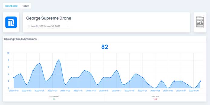
We manage to get leads, that means potential customers who fill in the booking form, at a cost of approximately $50 per booking form submission. That includes the ad spend and our fees, it includes all the costs.
With an ad spend of $3,000 per month, we manage get about 90 bookings a month with a Return on Ad Spend of between 6-10. That means for every dollar spent, we earn back $6 to $10 in revenue from booked customers.
Video: Tattoo Digital Marketing Results
Results
Based on our existing customers, we manage to get leads, that means potential customers who fill in the booking form at a cost of $52 per booking. That includes the ad spend and our fees. So it includes all the costs. We can do the same for you.
$25K/Month Profit
In the example we’re going to see shortly, the customer spent a total of about $30,000 over six months and earned back about $180,000. So that works out to $150K total profit over six months. And again, it works out to $25K month profit.
And when I say profit, I mean from all the advertising costs. I don’t know what you pay in rent and all that, but you were paying that anyways.
Tattoo Marketing Case Study
Let’s take a look at the results that we got for my buddy George Supreme Drone. He’s the tattoo artist that we’re going to use for this case study. And this is the landing page that you may have seen before if you’ve been to our website and seen my blog post about this.
So let’s go see what the results look like in Facebook Ads manager just so that you can see that, hey, this is real. The results are real and they’re all up in here. So let’s take a look at that. Okay, first let’s see the results.
Messaging Campaigns
Now we ran some campaigns that had messaging objective. So that means just asking people to message the artist directly on his Facebook and Instagram. Here we can see 105 messaging results. Now, besides the people who actually clicked on the ad, on the little button that said DME, now there’s also actually hundreds of people who independently sent a message. So they saw the ad and they clicked on the profile picture and clicked, you know, to send a message to the inbox.
So I know that approximately another 150 people also started messaging conversations based on these campaigns. So we got 105 of these, about another 150 of the messages.
Lead Gen Campaigns
Here we can see people who’ve filled in the form. We have another couple of hundred people, 150 who clicked to go to the form.
Bookings Spreadsheet
And all this is collected in a booking form. Let’s go and see that. So here is a spreadsheet where when somebody fills in the booking form, we send them over here to the spreadsheet. We send all their information here, so it’s easy to track. So just heading all the way down here, we’ve got 363 people who have filled in the booking form.
3 Customers Per Day
So let’s do some math here. We’ve got 105 conversations, plus 150 people who also messaged the artist, plus another 363. So that’s 618 people who have asked the artist to book a session to get a tattoo over the past six months, so divided by six, that’s about 103. Or exactly 103 divided by 31 days, so let’s say a little bit more than three customers per day, incoming customers.
$50 per Customer
Going back to the Facebook ads manager. Now, we can see here that we’ve got an ad spend of $14,500. And I know that the customer has also paid us our fees. And it’s about another so much. So let’s say we’re talking about more or less $28,000 that the customer has spent to get those 600 something customers. Let’s do a little bit of math here.
So that’s $28K in spend, ad spend, plus our fees divided by the 618 customers, so that’s $45, let’s round it up and say $50. $50 per customer, per incoming lead. Now, not every single customer who fills in the form will become a paying customer for one or another reason.
6-10 Return On Ad Spend
Some of them will end up not coming to an agreement, not having time, going somewhere else, forgetting about it, whatever the case. But as I mentioned in the beginning of this video, we know that at the end of the day, the tattoo artists, this artist and other artists we work with, they’re getting a return on ad spend of between $6 to $10. So $1 in ad spend leads to $6 to $10 in revenue.
Other Results
Now, besides the results and the bookings, there’s also other results that are achieved.
Reach
For example, if we look at the reach, this is how many separate individuals got to see the ads. So we’re talking about half a million people. That’s a very nice amount.
Frequency
The frequency which basically means how often did people see an ad is a little bit more than two.
Impressions
So that means that about half a million people saw an ad twice, which means that we have a bit more than a million impressions. Now, if you are interested in branding and just getting your name out there, this is an additional result that you’re getting through this advertising campaign.
Engagement
There’s also engagement. So here this is measured under the post engagement stat. And under this, what’s essentially measured is post shares, post reactions, post saves, post comments. When I say post, we’re mostly talking about the ads. Also page likes are in here, video plays that are 3 seconds or longer, link clicks as well.
So any kind of interaction with the ad is counted here. So that’s 240,000 interactions with the ad, very nice numbers. I consider that these are also results aside from the bookings.
Traffic
And finally another stat that I think is pretty interesting and useful that is here under outbound clicks. So these are people who are clicking on the ad and essentially since the ad is sending them to our landing page, this is landing page traffic. So we’re talking about almost 20,000 people who have seen the ad and have gone to the landing page and seen all the information and some of these will convert to customers in the future.
Summary
So there’s all kind of great results that we’re getting with these campaigns. There’s plenty of bookings coming in at what I think and what our customers think is an exceptionally good and low cost. And there’s all this exposure as well. And this is all the results that we’re getting to our tattoo marketing campaigns.
Hire Nextlevelbros
So as I said, if you’re a tattoo artist or a tattoo studio owner or responsible for the marketing and this is something you’d like, hit us up on our website at www.nextlevelbros.com that’s Next Level Bros, like brothers short, www.nextlevelbros.com we have a contact page, there’s a booking form and depending on where you see this video, there may be a button below this video. So yeah, feel free, book an appointment with me and we’ll talk about it and see if this is something for you. Peace out.
We don’t just run short boost-post campaigns on the weekends, that may or may not briefly do well, and that’s that. We run proper ad campaigns including retargeting, that are active 24/7 to generate a steady stream of new customers.
In the example I talk about in the video, our customer spent a total of about $30,000 over six months and earned back about $180,000. So that works out to $150K total profit over six months. That is $25K month of profit. When I say profit, I mean after deducting all the advertising costs.
Tattoo Marketing Results Highlights
Our Tattoo Marketing campaigns are a nonstop pofitable funnel bringing in paying customers for the studio and artist all year around. If you’d like something like that for yourself or your studio, get in touch, we can do the same for you.
Relevant Resources for Tattoo Marketing
Video Ad Creation Tools Links
- Offeo
This is my favorite Motion Graphics and Video Ad making tool. They have lots of great looking templates to easily create successful Facebook ads. The user interface is very easy to use and packs a lot of power at the same time. - Content Fries
Repurpose your content strategically in minutes with content multiplier software. Generate super accurate transcriptions and subtitles by using automatic subtitles generator. - InVideo
Good choice for video online editing. - Typito
Easily create professional grade videos with text. Use Typito’s drag-and-drop interface to easily create marketing videos.
Landing Page Builders
- Instapage
Create relevant, on-brand, mobile-responsive post-click landing pages and experiences without a developer. - Unbounce
AI-powered landing page builder with smart features that let you create beautiful, high-performing marketing campaigns. - SwipePages
Quickly create fast, mobile optimized landing pages without any code. Templates for every use case.
Heatmap & Session Recording Tools
- Attention Insight Validate your concepts for performance during the design stage with AI-generated attention analytics. Predictive attention heatmaps.
- Clarity Clarity is a free, easy-to-use tool that captures how real people actually use your site. Instant heatmaps, Session Recordings, Powerful insights.
- Yandex Metrica All-Round Web Analytics, from traffic trends to mouse movements – get a comprehensive understanding of your online audience and drive business growth.
- BannerFlow Quickly create fast, mobile optimized landing pages without any code. Templates for every use case.
Gain customers faster – Reach new audiences
Grow Your Tattoo Business with Digital Advertising
I’m Alexander Pereira, the Co-Founder of NextLevelBros, a digital marketing agency that specializes in marketing for tattoo studios and artists. Our team of digital advertising masterminds is ready to turn your business growth goals into an internet-marketing reality.
We’ve been in the advertising business for more than 15 years and have the skills to excel in all facets of digital marketing. Want to see where we can take your Tattoo business? Book a free appointment with me now.

